Ever wondered whether your WordPress theme was doing more harm than good?
I don’t really like writing overly negative posts but I decided that some of my readers needed to have a think about the news-style (also called portal) themes that they are using.
Don’t get me wrong, some of these themes are amazing and work extremely well for a lot of sites.
But for some bloggers they really aren’t doing you any favors.
Let me explain why. This is going to be controversial.
Your theme is a huge part of your brand
If you are new to marketing principles I’d recommend spending some time reading about what a brand is. To help you out I found a quote by the legendary ad agency founder, David Ogilvy. He defined a brand as:
The intangible sum of a product’s attributes: its name, packaging, and price, its history, its reputation, and the way it’s advertised.
As bloggers, the theme we use plays a huge role in our brand. [Tweet this quote]
It changes the way people perceive you.
It changes the way people interact with your content.
And with some news-style and portal themes the way people interact with the content is to browse and then bugger off without taking a whole lot of action. This is a broad generalization and absolutely not true of all of them, but it is a concern I have.
The Art of War: Appearing strong
There is a great quote in the Art of War by Sun Tzu that says:
Appear weak when you are strong, and strong when you are weak.
In a way these news themes are helping you to do the last part: appear strong when you are weak.
How do they do this?
Well, they add lots of features and make things busier than they need to be. This gives the appearance that your (perhaps new?) blog is vibrant and busy and has lots going on. Sometimes this can even be a bad thing. More on that later.
1. Image sliders
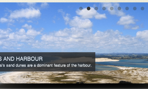
A lot of them have image sliders up the top that serve as eye-candy featured content. Some of these work really well but often what happens is they end up hiding the content you are trying to feature because people scroll down and miss the slide before it gets a change to be revealed.
2. Multiple navigations
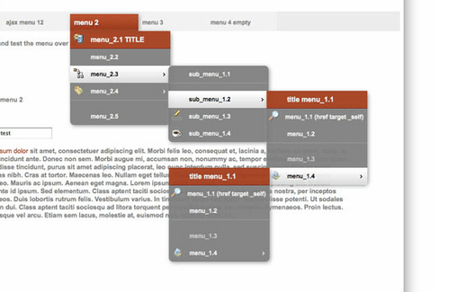
The navigation is often present in various forms (categories, archives, tags, drop downs, etc.) which confuses and congests. Sometimes these menus work great for a website but other times it is a sign of poorly organized content.
As we know, more options does not always equate to more decisions, or better decisions, on the side of your readers. In fact, it often leads to less action. [Tweet this quote]
3. Newspaper display of homepage articles
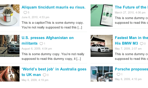
The homepage is often a collection of small sections of your latest posts with the attached image or graphic. In my opinion this really does not feature the content anywhere near enough. Even master copywriters would struggle to generate click-through interest with half a sentence.
What is REALLY being featured here?
Now here is the real thing that worries me: often it feels like the real thing on display here is the theme, not the content.
The features, design and functionality is often so cool and cutting edge that they don’t really feature the content all that well.
And that is absolutely not what you want your theme to do.
I should stress again that I am not saying all news themes are bad for all bloggers all of the time. I am just putting an idea out there that sometimes I feel like these themes detract from what a theme should really be doing.
Well, what should we be doing?
The next logical question is to try and figure out what we should be doing instead.
Simplify man!
I really believe that for most of the bloggers reading this post a simple, clean and focused WordPress theme is a much better solution than a busy one with dozens of bells and whistles.
This is what I am doing with Tyrant Themes – creating WordPress themes that, in a way, take things back a little bit to when there was less noise and more intelligent minimalism.
Oh, and this site is currently being re-designed along those lines (as a few of you have seen!).
Big guys keeping it simple
What I want to do now is show you a few of my favorite bloggers who are doing well with simple designs that are focused on the outcomes that they aim for. It is extremely interesting to me that many of these big guys are opting for a “less is more” design approach.
1. Quick Sprout
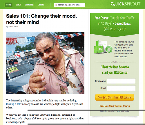
Neil is one of my blogging heroes. I’ve said it a few times now but this is one of the only websites where I read everything that is written. He really knows what his readers want.
And in that same way, he really understands how they want to read his content. He has even written about how he simplified things after a re-design.
2. ViperChill
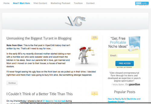
Everything about Glen is simple.
Okay, enough joking around! The ViperChill redesign that we see now is one of my favorite blog designs on the net. It is clear, focused and uses white space extremely well to keep the reader looking at the words.
And look at the categories – there are four. Simple buttons to click and navigate.
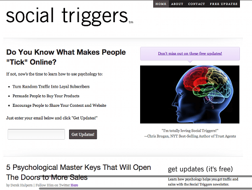
Derek from Social Triggers is someone I’ve been talking more and more about lately. He does a lot of things right. Oh, and he gave me some great advice recently which I’ll be sharing in a post next week so stay tuned.
Social Triggers is simplicity at it’s best. It’s about reading the article and subscribing to the list. Other than comment and maybe send out a Tweet there isn’t much else to do. And that’s the way he wants it.
Final thoughts and over to you
As I have said, not all news themes are bad. Some are amazing. But you need to be very careful it fits with your brand and how you want your readers to interact with your content. It has to be a nice match.
What do you think about all this? Is your site too busy? Are you too afraid to take things away and keep it simple? Please leave a comment.

Hi Glen,
Perfect timing with this post! I’ve changed my theme a few times and just can’t seem to get the right balance (doesn’t help that the hp slider is broken and there is apparently no support).
I’m thinking my site is now too dark and a little cluttered. I also have a post with around 160 facebook shares but it’s now burried.
My audience likes the pretty pictures but also the stories so I’m not sure which way to go.
My site is also a social network so I’m torn between driving people to create a profile or if I should get people on the email list.
Thoughts?
Let me have a look.
And my name isn’t Glen.
😉
Oh crap what a moron! I had Glen in my head from reading it in your post (and trying to quickly comment before my boss catches me ha ha) … it’s definitely Friday afternoon!
My apologies Ramsay
No worries at all.
Hi again Elise.
Love your logo! I think it would look better centered though.
Also, the footer is having some problems.
If that was my site I’d make the blog page the homepage. Seems to flow better for me. Then just focus on making your menu items simplified and awesome.
Hope that helps.
Ramsay
Thanks for the feedback (despite my faux pas) I’ve been trying to centre the logo and fix the footer but gave up after I had to rejig the buddypress stuff. Worst template (code) ever!
Maybe I should just get a new one … I will go ahead and change the homepage though.
Think I’ll go get a coffee now and improve my concentration levels. Oh and thanks for the link below
Thanks for commenting!
And good luck.
Sorry to double comment but I love how I was just redirected to another page thanking me and telling me to sign up! How can I do that?
I’ve got that covered!
https://www.blogtyrant.com/redirect-blog-comments/
I love the simplicity of your blog actually.
Have tried to get a similar feel for one of my blogs but didn’t really work and then I changed it again.. and again and again..
I might pull a Copyblogger move and release this one as a freebie when I start using my new one.
Well I did register for the “Tyrant Themes” 😉
I tried to muck around with the menu bar but that kinda failed (or just didn’t work) which is annoying.
I love Thesis tho.. its really easy to use
Yeah Thesis and Studiopress are both excellent.
Don’t get your hopes up – I’m not trying to compete with those frameworks with TT. As I said, I want to simplify things right back.
I’m a fan of minimalist style themes. Everything else is just too busy (at least for my test). While sliders are cool, for the most part, they’re used poorly. And while a feature might look neat, it doesn’t necessarily offer anything constructive to the user.
What do you want people to do once they land on your site? Great. Now how can you eliminate distractions to take the guess-work out of them taking those actions?
That’s the way I see it anyway.
Now, in your post you mentioned ViperChill and his categories (currently at 4) – that’s something I need to clean up myself. Right now, I have a handful that I use regularly. The rest, I need to get rid of and simplify. So thanks for the reminder!
I’m the same. Too many categories. In the end I realized via Google Analytics that people weren’t using them to navigate so took all that away. Now it is just popular posts.
I had at one point 40 categories on one of my running sites but dropped it down to 6 at the moment. Was just annoying to maintain and specify every post.
Sounds like tags to me Ralph… 😉
Tags have, for me at least, been ranking a lot faster in Google than anything else since Panda. Interesting.
No really, all categories and then again sub categories.
Kinda went really really fast and I just lost the plot.
Running divided into 6 cat. and those again in 6 categories. But now just have 5 or 6 which work out enough.
Haven’t really done a lot of tagging actually since I thought it didn’t really matter that much anyway..
Interesting that tags are ranking so well now. I’ll try to remember that.
In my first blog ever I was using more tags than categories (mostly because I didn’t know much about SEO back then).
That blog has been doing really good.
The challenge is to get out of your own head sometimes. It’s easy to fall into the trap of, “I think this theme is cool, so my readers will definitely think it’s cool.”
Similarly, I think bloggers put pressure on themselves to look big and professional. I’ve certainly felt that: “People won’t take my site seriously unless it looks like the CNN website.”
Having just read “Ogilvy on Advertising,” here’s another quote from the master:
“When I write an advertisement, I don’t want you to tell me that you find it ‘creative.’ I want you to find it so interesting that you BUY THE PRODUCT.”
Ogilvy addresses how people try to impress colleagues and judges who give out awards. Rather than focusing on attracting and converting customers, which is what really sustains a business. You can’t live on praise alone, but we often chase that.
yeah totally agree. Lot of times I see a theme that I like and think/hope my readers would like too..
Well said Marcus. As always, love your comments.
I think it’s Derek (again!) who says that he knows he’s making progress when he gets criticism.
Nice work.
I have long thought the same about news/magazine style web themes. Cut down on the noise. Steer readers through your site by making it clear where you want them to focus.
Coincidentally I have just finished creating a site for a client using a news theme I built myself (one of my hats is web design). Still, it’s fairly simple as these things go. It features a slider promoting certain posts, but if you scroll below the fold you’ll see those same posts, in full anyway (and brief enough that they’re easy to scan).
Oh damn, I forgot they were also called magazine themes. Might have to add that to the post somewhere.
Thanks Tracey!
[…] See the article here: Why News-Style WordPress Themes Are a Bad Idea for Some … […]
Ramsay, like you pointed out here, the blog design really shows who you are to your first time visitor and it decides if the visitor will stay around or give you another 0.00 page view or time on site.
I’ve had lot of theme changed on my site but when I decided to leave it at the current one, i did so because I do not have the funds yet to design my personal premium theme….
Glad reading this epic shit from you
Sheyi
Thanks Sheyi.
Definitely agree here! I try to keep my blogs as simple as possible. I didn’t even pay for a premium theme or make too many customizations to the free theme I’m using. I want my site to be about providing value for my readers and making it easy for them to consume my content!
Thomas
Sounds like you know what you’re doing!
Thanks Thomas.
Man, you “threaten” us with those themes…don’t know what to say :))
You know what I’ve noticed? Some sliders are good for SEO. They output the excerpt of the article and improve the keyword density. Look for example at the theme I use on my blog: it does have a slider (but I’m not showing it). When checked in a tool like SEO browser you’ll see it does pull out the excerpts of the things you put in the slider. In the slider of my theme you can input these manually which is even better.
That is a really interesting point. I’m going to have to investigate this further.
Thanks mate!
I love simplicity. And clean themes where you can immediately find what you’re looking for.
Quicksprout is also the first in my list of cool designs.
Cristina
Agreed. Neil knows what he’s doing.
Greetings BT,
This post came at an interesting time because it made me think about some recent changes to one of my site. I added a slider to the homepage but as you suggest in the post most site viewers never get a chance to see what going on in there.
To add to this, most people actually enter one’s site via a link. Thus, never really seeing the homepage.
How important is it to place emphasis on the homepage? Is it better to ensure that the internal pages provides a better experience? For instance, the Studiopress themes allow you to alter your sidebar according to the pages.
Hey Simba.
I think the homepage is usually pretty good – it’s the inner pages that people forget. As you say, most people enter the site via inner pages so it’s important that they tell your story without expecting people to visit the homepage.
Hope that helps.
I really appreciate this post because I switched from a news theme and wondered if I had made a mistake. I think a news theme requires a LOT more content than I can produce in a quality fashion, so it’s okay that I left it.
I have to make another comment on the “Tweet This Quote” plug-in (I’m assuming it’s a plug-in you’re using). I went to a blogging conference this spring and the presenters were constantly saying, “You can tweet that.” I’m a professional speaker in my 40s and I couldn’t believe the arrogance of that. I think it’s a generational difference, but I don’t want to be told whether to quote someone or not and I really don’t want to be told what is quote worthy. Maybe I’m just old. 🙂
Hi Melanie.
Good work on the new/magazine theme. I think you’re right, they are a lot of work.
Regarding the Tweet This Quote – that is a really interesting point of view I’ve never heard before. I can see how it might come across like that.
My view in using it was to just make it easier for people to tweet stuff that their audience might like to read. Like the news theme, Twitter requires a lot of constant value adding.
Lots to think about. Thank you.
Great overview and write up on what works and what directs attention away from your goals.
One if my favourite bloggers is Danny Brown and I think he has a great homepage before you reach the blog:
http://dannybrown.me
It gives a great overview of what he does and also why he is worth reading (the Hub spot number 1 badge).
Food for thought as I start my own blog, thank you!
Thanks Patrick. Yep, Danny does great work.
In the age of info overload less is more cause if you add any distraction they wount read , Glen has simple, clean n good blog design.
I am gona make a new theme like it soon 🙂
Yeah, Glen’s is a good one to learn from.
Ha,reading Elisa’s comment made me want to see the squeeze page – first motivator to comment!:-)
Your post is not controversial at all, I am afraid;-) You are right to 100%
I am in the process of designing a new blog. I absolutely love clean, simple bare bones themes.
Now, the new blog is about self-improvement for mothers, it’s about sharing personal stories (mine but more importantly from my readers) – I wonder if you know of any examples of a theme/blog that comes across as “warm, caring, a safe place to share” a feminine site without cheese stuff and cup cakes?
P.S. so far loved every single post I read here!
Thanks for the kind words Anastasia.
There are a lot of goodies here: http://www.tripwiremagazine.com/2012/05/simple-wordpress-themes.html
Hope that helps.
As someone who still feels like a newbie, I was thinking along these lines myself but wasn’t sure who to say it to. I was sure that I would get bombarded with answers that would be contradictory to the way I feel. I am so glad you think like I do.
Hope it helps.
hello im pretty new to your blog, been reading it the last week or two maybe
very very helpful. so i wanna say thank u.
i am a little overwhelmed with all the information i came across in your blog lol. but its all good
one thing i wanted to ask u that might help alot of beginners out navigating in your blog.
howcome you dont have a search engine or section?
i wanted to search some stuff on your blog but could not find it.
hopefully im not asking a stupid question and its right there in my face but i didnt see it 😀 ( sorry incase i did that lol)
but your blog is very helpful for beginners, yet a little overwhelming as well. its nice but like u said in one of your posts, getting into a new community can be intimidating a little 🙂
take care
Hi Rima.
Thanks for the kind words.
That is a really good question. Actually, I found that people weren’t really using the search bar or the categories navigation. People really only clicked on popular posts or related posts so I decided to just keep things simple and clean.
Would you prefer a search function?
i think it would be a great option for people like me who like to search.
the way i found your website was searching through probloggers for post about newsletters and somehow i saw your guest post.
you have very informative and practical information which makes me want to search more stuff that i am particularly looking for.
so to have the search engine would be helpful for me ( and i think in general other bloggers)
its like salt and pepper shakers on the diner tables. you might not need it, but its nice to have the option there lol
thanx for replying back
Alright, I might have to give it another chance.
Good morning!
I’m not computer savvy, so I have to admit I haven’t understood some of the things in your post – but thanks for the stuff I did understand!
Being cheeky, could you direct me to something I could read about tags, please? I haven’t the faintest idea what or where they are on my blog thing, but it sounds as though I ought to learn about them from what you have noted in relation to Ralph/Niche Websites. My poor ‘baby’ (blog) could use every bit of help it can get!
Linda, are you on WordPress?
I am indeed, Sir.
Beyond that I know it isn’t a free WordPress site, I know next to nothing! I write…. but I am trying to learn more.
Tags are like sub categories and keywords.
So if the category is “travel” then your tags for a particular post might be “sydney” “australia” “overseas holidays” etc.
You add them to each post in the editor area underneath the publish button.
Try to re-use the same relevant ones over and over.
Hope that helps.
Thank you so much, Ramsay!
Nicely explained – even I can understand and I’ll be tagging from now on…
Hi Ramsay!
Great post and fantastic revealing! Just a very quick question on the squeeze page you write about in a reply to a comment. Does it only recognise a first-time commenter
like me?
Kevin
Hi Kevin.
Yep, only works for the first timers.
Hmm.. Nice tips..
I would like to add one more thing.. for most of the newbees, when they buy an awesome looking theme, and later they find out that the same doesn’t look good on their site. Reason being poor quality and of different resolution pics which seems so out of place.
Great point! As they are so photo dependent you often have to spend a lot of cash to get good photos.
You nailed it again! My one wk old (new) WP site is super simple by design. When searching for a theme I loved the new fangled sliders. But I realized quickly how a reader would be frustrated if they didn’t get to read the little bit of content before the slider changed. Buh bye. So I chose good old fashioned minimal and concentrated on content and key words. Less than one week and I’m on page 7 for Google search “affordable business plans”. It will be page 1 within 3 weeks. Happens EVERY time for my WordPress sites. I’m a freelance writer specializing in business plan writing, but maybe I should teach how I reach page 1 within 3 wks of go-live? (I’m no techie. I’m a grandma who happened to figure it out and replicated the process and results many times.)
Sounds great Sylvia! Maybe you could share it here in the comments?
😉
Ha ha! I feel an ebook coming up…”How to Get Page 1 Rank in Google Only 3 Weeks after Go Live!” I’d better get to work.
I have to admit Sylvia, I am excited and intrigued but a wee bit skeptical.
Challenge accepted?
😉
I’ll give you a hint. But I get the feeling the details can be worth a little something.
When I was setting up a WP site for a previous photography business I knew I needed to rank on the 1st page (Google) locally. So I just studied the other sites on the first page and noticed they all had at least one thing in common. I used the same tactic and presto! By the 2nd week I was #3 on page one! I had a bunch of other domains I hadn’t done anything with so I experimented. Tried the same thing with each of them and voila! First page ranking for all of them within the first 3 weeks. Swear to god.
I’m not into this stuff though (making money from websites that are set up just for the sake of making money). I’m building a long term career as a freelance writer (my passion). So rather than get side tracked with these other sites I shut them all down. (One involved using celebrity photos and I got nervous I’d get some lawyers after me.)
As to what was the thing these sites all had in common? I think I’ll hold on to that until I decide if I should do an ebook.
There she goes. My new website, yesterday page 7, today page 2. It’s amazing.
If I knew what to do with this knowledge (how to rank page 1 in 3 wks) I’d be rich. Ha! But I don’t.
I bought Aweber today for this website (freelancebusinessplan.com) and I wasn’t able to add the code to the sidebar in the editor. Told ya. I’m no techie…
Hi Sylvia.
Ran out of replies up there.
I’ll be interested to see whether those rankings last as Google is now quite focused on freshness.
Great work!
Ah, that might explain why my first writer’s site slipped from 1st pg to 2nd pg yesterday. It was on 1st pg for months (again when just 3 wks new)but now I’m concentrating my efforts on the 2nd site (which is shooting up the ranks). And both have minimal posts (5 or 6).
Update. The website in question (freelancebusinessplan.com) is now 1 wk old and on page 1 in Google search for “affordable business plan writer”. It’s still on pg 2 for “affordable business plans”. I just bought the domain on 6/13/12. Pretty good huh?
Forgot to mention that I’ve been studying Blog Tyrant’s posts (after I set up my site-doh!). I have begun to revise the content to be more engaging and less formal. I wonder if I went too far though?
And I set up the Aweber subscription form and rewrote an ebook (just one chapter) to give out free.
My next plan is to write a pillar post with tons of resources and really great content. I was always afraid of adding others’ links as resources (didn’t want the reader to find a better site). But I realized that the blogs I return to over and over are the ones that provide tons of resources.
I’m still learning and thanks to you Tyrant, I hope to grow my readership (and clients). You are brilliant!
Thanks so much Sylvia. Good luck with your rankings!
I love the simplicity of your blog actually.
Have tried to get a similar feel for one of my blogs but didn’t really work and then I changed it again.. and again and again..