
A user-friendly blog is essential if you want to make sure all your traffic acquisition activities don’t go to waste.
When you first get started on a WordPress blog there’s a temptation to be overwhelmed by all the choices you have for your design, functionality, technical setup, etc. Sometimes all of that cool stuff can lead to a bad user experience.
For example, these days there are a lot of beautiful WordPress themes and I’ll often see people choose a visually stunning template that takes ages to load because it is so graphically heavy.
In today’s post I’m going to show you a few simple ways I’ve tried to make my blogs more user-friendly in the hope that it helps you build a blog that your readers really love to be on.
Shall we?
How to make your blog user-friendly
As always, a lot of this stuff is based on my own experiences and could be very incomplete. If I’ve missed anything please leave a comment and let me know.
1. Simplify navigation based on a goal
One of the main pitfalls that new bloggers fall in to is the idea that visitors should be able to access any part of their blog from any page. It leads to a complicated navigation system that, most of the time, just makes people more confused.
For example, in this post we looked at what links the top blogs put in their menus. It was quite interesting to me to see how minimal a lot of them were, and how they are generally focused around a goal.
I recommend looking at your overall blogging strategy and deciding carefully on what actions you want people to take when they visit your blog. For example, do you want them to sign up to a mailing list or do you want them to purchase a product? Both of these options will lead to a drastically different navigation.
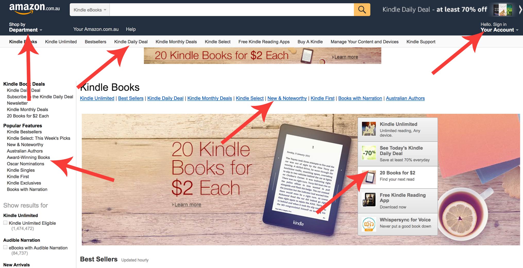
One example that always amazes me is Amazon.com and their tendency to add as many menus as possible. They are everywhere! It’s interesting because Amazon is famous for making their checkout process one of the simplest in the world by reducing the amount of steps you need to take.
It might be necessary for sites like Amazon to have this many menus options, but it really isn’t for us. There’s only a few options that a reader might want to take and, often times, it’s best for us to suggest a navigation option for them as they are totally new to the site.

Another important point is to remember that a navigation menu doesn’t have to be static and can (and should!) change based on different events or page structures. Above you see a screenshot from The Next Web where they have a scrolling header bar on their conference page that allows you to quickly buy tickets.
Making a blog user-friendly often means making things easier to find and that has a lot to do with how the menu is structured for different promotions, goals and events.
2. Increase your font size
While the overall design trend is now moving towards larger fonts there are still a lot of websites and blogs (especially in corporate niches) who stick to a small font size. This is a big mistake as we can see summarized in this article as far back as 2011.
A larger font has a few benefits when it comes to user-friendly design:
- Easy to read long content
Larger font sizes cause less eye strain and thus makes it easier to read long-form content or difficult content that takes you a while to digest. - Better for the elderly and others
Small fonts can be really difficult for the elderly and those with eye problems and while many of them can adjust their screen zoom to compensate there is a large population who is new to web browsing and need more assistance from a design point of view. - Content that stands out
The last point is that you really don’t want someone to miss a promotion, link, etc. because the font was so small that they glanced over it, often because people are scrolling really fast and moving on. That is a prime example of when your design impacts on conversions.
Of course, we don’t want to have disgusting huge and obnoxious typography either – it needs to match your branding and style-guide (should we should talk about style-guides?) so that the whole visual experience is very easy, flowing and natural for your traffic.
3. Make sure everything loads quickly
As we all know, it is critical that your blog loads as fast as possible in order to prevent an increased bounce rate, user frustration, etc. It’s also important to remember that a slow loading blog will often lose rankings to those that load faster – Google wants to link to the best quality websites.
Some of the quickest ways to speed up your site include:
- Use a caching plugin
Use a caching plugin like W3 Total Cache so that your blog doesn’t load pages every time someone call them up. - Optimize server-side configuration
Your sever staff can do things like enabling Gzip and helping you set up a Content Delivery Network in order to deliver pages and posts as fast as possible. - Compress big images
Do you have a lot of blog images that are HD photos or big graphics? Well, a lot load time goes into displaying images and as such it’s important to save them as small as you can without losing quality, and then compress to remove all the extra information that jpg and png files tend to carry. You can do that with a plugin like this one.
As an little aside, a fast loading blog is also better for the environment because it theoretically uses less energy to power each visitor’s time on site. That’s pretty important if you’re getting a lot of traffic.
4. Change your theme design to encourage site flow
Some of the best blogs are really nice to visit because the design inherently teaches you how to move around the site and how to interact with different elements, content, etc.
For example, if you look at an article like Science Isn’t Broken you’ll see how the menu changes to help you find your way around the post:
This can be used in a variety of ways depending on where you want people to go next. For example, if it’s an advanced tutorial you might want to direct them to the next stage or a related topic that builds upon the post they’re currently reading.
You can use graphics and colors to indicate different areas, changes in content, separate categories, etc. Try to think about how you can use you theme to guide people around the blog naturally. I tried my best to do something like that on this page about how to start a blog:
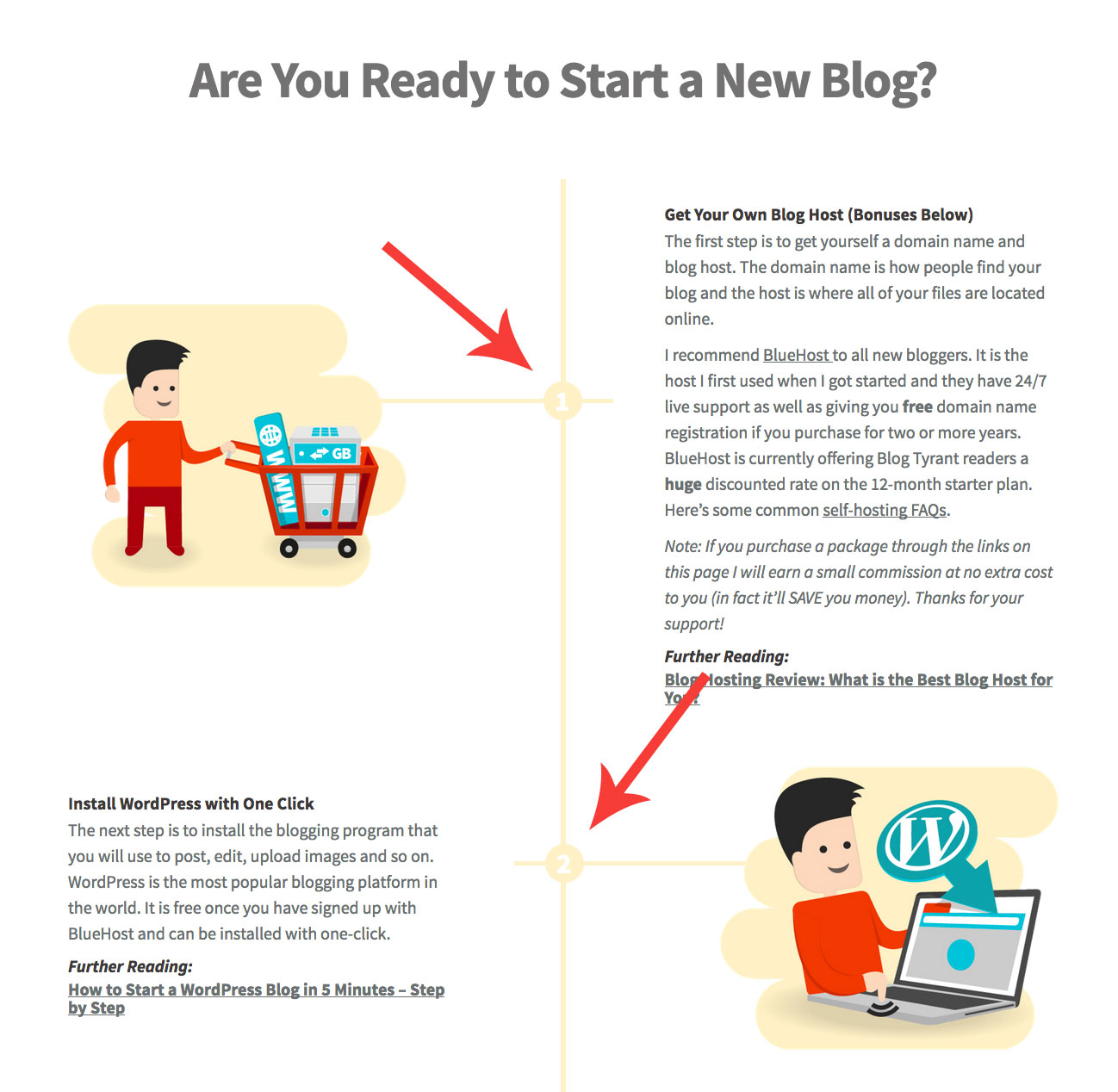
I’ve used numbers and a kind of timeline design to draw people down the page to see the different stages of starting a blog at a glance. My hope was that with a design like this there would be very little confusion about what to do next. The possibilities are endless and, thankfully, a lot of good WordPress themes have stuff like this built in.
5. Be careful about how you use pop ups and slide outs
We all know that pop ups work. The annoying part is that they’ve become so wide spread and mainstream that people are trying new and annoying things to get more attention.
For example, the other day I visited a blog that had a pop up on arrival, a slide out offer and then another pop up that was triggered when I tried to leave (that’s called an exit pop up). I was only there to get a small piece of information and it honestly wasn’t worth all the clicking.
Interestingly, Google is now penalizing websites that have pop ups that affect the mobile experience. As such, I’ve totally removed pop ups from mobile devices just to be sure.
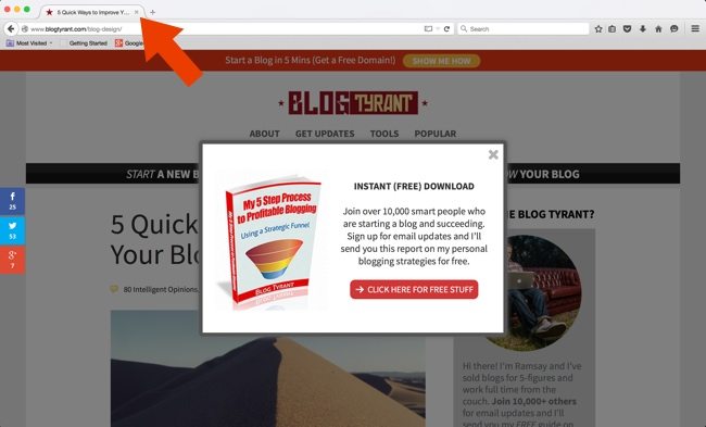
There is nothing wrong with a pop up, but make sure it fits with your brand and doesn’t impact the user experience in any immediate way. Set them to appear after 15 or 30 seconds, or just use and exit intent one that only appears when people are done with your content anyway.
Most important, however, is to test these things to see what is getting more subscribers, and whether those new subscribers are actually engaging in your content after they have signed up.
6. Make it memorable and enjoyable (especially on the sticky points)
A big part of a successful brand is one that is distinctive and different and memorable. If you can find a way to do that on your blog you’ll go a long way to improving user experience because people perceive the site differently.
One of the reasons many download/crunching websites employ little “loading” animations is because it makes you feel like you are watching some kind of process instead of just regular load time. As such you get less frustrated. Here’s an example from Pingdom that I like:
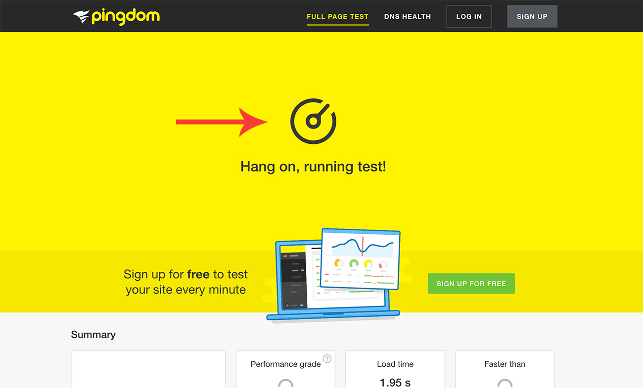
This is an interesting example of how you can use design to make you website a little bit more user-friendly, even if it isn’t actually going any faster. As bloggers, we might add something like this to the email sign up process – especially if you are doing double opt-ins and people might get bored waiting for their email to arrive.
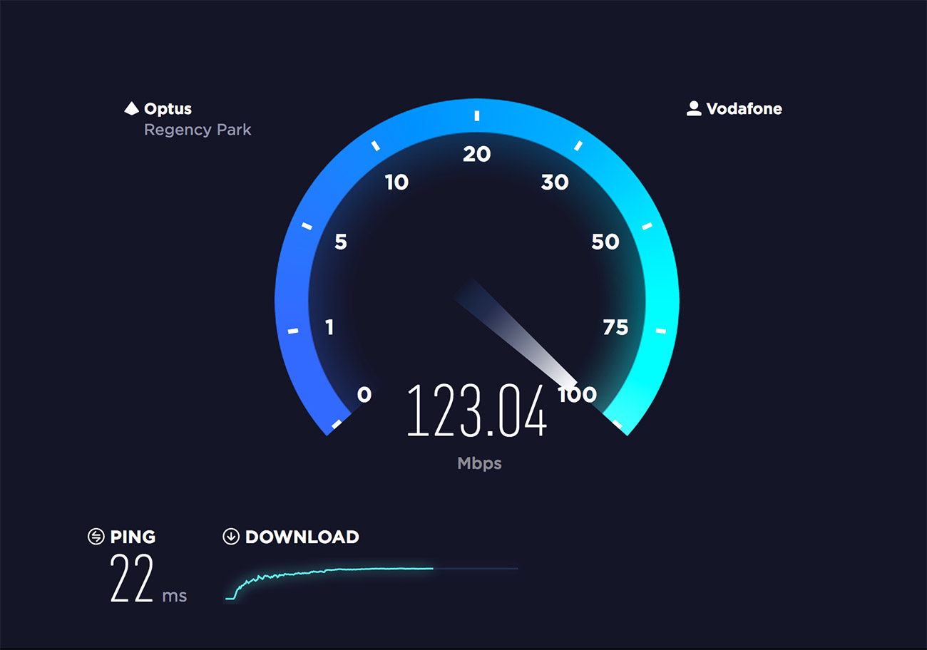
I found another example of this a few years ago when researching how to speed up your Internet at home. This particular speed test has a great “speedometer” effect that you sit and watch and enjoy instead of getting frustrated that the test takes between 1-2 minutes.
Of course, a regular blog doesn’t have a lot of need for advanced graphics just for the sake of it. But you might be able to take inspiration from these types of things (and design blogs like these) to develop some extra design element that makes your blog stand out from the others in your niche. It doesn’t take much, but can make a visit to your blog so much more enjoyable.
7. Minimize
The last thing I wanted to talk about was how important it can be to simplify your website. That means getting rid of clutter and figuring out what people really want from your blog.
For example, here on Blog Tyrant I try to publish quite long articles and as such I want the focus to be solely on the words and images that appear on screen and, in the case of affiliate promotions, the links that I put in the content. This is why I redesigned the blog to have no sidebar and an improved focus on content.
You can see some more popular examples of this on sites like Zen Habits where Leo took pretty much everything off the site except for black text and a few links. It is truly minimal for a site with two million readers!
There’s no need to go to that length, but I recommend at least taking things like blogrolls, links to other sites, advertising, etc. out of your sidebar and replacing them with a simple intro and email list offer.
How to take user-friendless to the next level
If you really want to take this stuff to the next level you need to test it. That is the only way to get reliable information about whether or not a change has been effective.
A simple and cost-effective way to do this is to literally invite a few friends over to your house, sit them down on your laptop and watch them navigate around your site. Give them a few tasks (like signing up to your list) and see what roadblocks they run into. It’s cumbersome but you’ll be surprised what works.
But if you want to get more high-tech you’ll want solutions like Crazy Egg and Optimizely which are websites that can do things like track where people look, click, as well as testing multiple versions of your blog or sales page to see which one works best and which one causes people to leave.
Is your blog user-friendly?
I know we all probably think that our own blogs are extremely user-friendly but I’d love to know what makes you think that. Have you changed anything and seen a big increase in time on-site or other relevant metrics. And if you’d like me to change anything here at Blog Tyrant I’d be very open to the suggestions.
Please leave a comment and let us know!

Great article as always! I like that most of your advices are simple, something you can do for free by yourself. Thank yoy!
Glad you enjoyed it!
Same here Ramsay i also enjoyed it.
Nice article.
100% agree about keeping a focus on your blog and ditching sidebars.
Another thing I hate are ads. I often leave a site if there are too many ads. Even if I really want to read something – I’m out of there!
Nice, clean and easy 🙂
Yeah they can be really annoying sometimes.
Hey Ramsay,
One thing I agree with is that choices are overwhelming. At the same time, thanks for coming up with ‘simple changes’ we can use, unlike others who are still mailing us “shocking changes you don’t know about” kind of things 😉
Though, what overwhelms me even more are the choices I’m often unable to make. Focusing on the side-stuff instead of the actual purpose is painful; it shouldn’t be SO important.
I’m on the side of simple. I keep my site minimal, and include whatever seems to be a necessity.
As for suggestions for Blogtyrant, I can’t think of any. You seem to always get it right and act on things before we can judge you.
* You changed the pop-up; it isn’t irritating.
* You updated the e-book cover. Beautiful!
* You aligned the content in the center. Better.
Actually, I notice all these little changes you make and keep appreciating them in my mind.
Though, I hope Blogtyrant to expand in future and become an ultimate spot for bloggers – not like some forum or tutorial site – but one having more interactive stuff such as:
* Quizzes
Example: ‘Find the right plugins for your blog as per the size and budget of your blog,’ ‘What site design is ideal for your niche? Use this interactive tool to find out the right colors, site-elements, etc for you,’ ‘What earning strategy is right for you? Use this form to get the ideas that might be perfect for you.’ This can be both useful and fun!
* Customized solutions
We read content because we want specific solutions. However, I think you can be a pioneer in providing tailor-cut suggestions for bloggers according to their current situation instead of the general stuff. (‘Enter your current budget’ ‘Enter the purpose of your blog’ ‘Who’s your ideal audience,’ etc.) and then providing solutions based on this data (‘Here’s a specific checklist of ideas you could be implementing on your blog’ – you can download it as PDF).
There’s a lot.
I hope that Blogtyrant dominates by becoming more distinct. I wish it becomes a go-to site for needs of all bloggers. Like, what Google is among searching engines.
Got a blogging problem? Blogtyrant.
Period.
Man, you always leave good comments. If you have any ideas about developing that extra content I’d be happy to pay you to work on some.
YES, for sure.
Sent you a mail.
Thank you!
[ Smiles ] Ramsay, I am in full agreement with using bigger fonts. Like you, I came across well-written articles that were a bit difficult to read, because the fonts that the blogger used was too small.
The size of your fonts are perfect!
Thank you. Glad it’s working!
As usual Blog Tyrant is more than a class to me. Thank You Ramsay and welcome in Africa(Tanzania).
Thanks, Mawere!
Another great article. Thanks!
W3Cache, as I recall, didn’t play nicely with my theme or some other plug-ins. But I will check out the other suggestions.
I’ve been wanting to do a site redesign, so I’ll keep these ideas to simplify in mind.
One trend that annoys me is a Flash landing page and you have to wait for the menu to appear, or it’s very tiny and just three bars and you have to click to see the options. We used to call this “mystery meat” navigation. It’s TOO simplistic to the point of annoying.
I think “Okay, you’re cool! I get it! LOAD THE PAGE!”
Yeah W3 can be tricky. I got rid of it and had a custom solution made for that reason. Caching can be a huge topic so I find it’s better to get someone to help you implement it – but definitely do it because the rewards are big. I recommend http://davidsj.co.uk/ for that kind of stuff.
Wow! Great article, Ramsay.
I’m always up for new ways to improve my blog.
I’ve been blogging for six years and have seen SEO go up and down, but never really amount to much. I don’t know if a subscription popup would impact my super small numbers. A mailing list is something I want to start this year.
If we already subscribe, why do some blog’s still ask us in a popup?
Love Pingdom and recently checked my blog’s loading time. YouTube videos really slow it down.
I like your idea of cutting down on menus. I have waaaay too many. I want readers to click around my site to other stories. I hope it’s user friendly.
Maybe you could take a look and click on my name… *crosses fingers*
Hey Susie. I did click and I did see a mailing list. What is it that you want to start this year?
Hey, Ramsay!
That’s a subscription form for my blog. I upgraded to a business site and would like to build a mailing list through Mail Chimp. I plan update those followers monthly and will include my blog post links. When I finally roll out my books, I can give them the heads up. WordPress.com makes it hard to subscribe without an account. I just hope it doesn’t pop up to those who already subscribe. We’ll see…
Interesting. Let us know how it goes.
Ramsay, I was actually looking at your navigation strategy on your blog as you asked to share my views. It is interesting to see that you have not offered any options for your “blog” readers to filter down to a particular category to find related articles.
Say if you blog about “pure blogging and everything related”, many other similar blogs have offered filter down categories such as “content”, “writing”, “marketing”, “SEO” and “social media” etc. I can understand that perhaps you have gone for a safer approach and produced lesser number of articles but better in quality and hence there is no need to thin in down to further categories.
Would be really interested in knowing your stance on this observation?
I personally blog about “blogging” as well and as a minimum I have offered my readers 3 broad categories “content”, “marketing” and “general experience”. Any views welcome.
Hi Ahmad.
Thanks for the comment and feedback.
I got rid of that kind of navigation years ago and focused everything in on a couple of outcomes – my mailing list and affiliate sales. So far it has been going well, but I do get some people asking how they can find certain articles.
I am thinking about adding an interactive search function is basically just a large bit of text saying “I need help with…” and then result show after that.
Makes perfect sense, thanks for your explanation.
Hi Ramsay, I have been following you for a while now but i’ve never dropped a comment for once.
I like this article and want you to please take a quick look at http://www.oasdom.com
It’s a website I’ve started for a year now, What do you thinks about the website being user friendly?
Looks great, Steve! My only suggestion would be to avoid stock photos if you can.
OK Ramsay. thanks for that
Hi Ramsay,
Amazing post, i am going to try out the tips you have shared.
Thanks for great share.
Have good week ahead.
Hope it helps!
The small font section hit home for me. My site also loads slowly so working on that because it pisses me off, so hate to think what it does for my readers! Thanks for the great content Ramsay, I personally love your website so don’t have any suggestions for it. Cheers, Olivia
Thanks Olivia.
Just curious Ramsay, have you tested whether your social sharing buttons bring traffic? I tried on my blog and decided to delete them because it was bringing me roughly 10 visitors day, very little considering my blog has an average of 200,000 monthly visitors.
You’re right, knowing whether our blogs are user friendly is hard because we don’t think like a new visitors. That’s why I like to use peek usertesting. It’s a site where you can get 3 (I think) videos of random people visiting your website and commenting about their feelings and impression. It’s a good way to get feedback.
I don’t think the social share buttons do much but as soon as I get rid of them people ask for them back!
I really appreciate your point about having a goal-based main nav. Educating business owners and sometimes even the marketing department folks about the importance of that, is both challenging and rewarding. Once we can get them past the stereotypical thinking, it results in website designs and nav structures that are more enjoyable/easier for the user.
P.S. Gotta love your artsy stormtrooper for this post!
P.P.S. There is nothing I would suggest as needing improvement on Blog Tyrant. Your website and the experience are great. I like the options you include for commenting notifications 🙂
Thanks, Scott. Always feel happy when I see that you’ve left a comment! One of the originals!
Thanks, Ramsay!
Thanks for all the suggestions, Ramsay. I’m torn about the sidebar, though. I agree that ads look cluttered and plan to remove my sidebar ad soon. But I visit some sites that have quite a lot in their sidebars–usually links and images to more posts. I do like that, but I also like a more streamlined, simple look, too. For now, I’m leaving my website as is but will consider your suggestion for future changes.
I definitely need to darken my font, maybe also increase the size. I chose my theme so I could sell my handmade textile items without having to pay for additional coding. I haven’t sewn a stitch, yet. Perhaps I can tweak this myself. My mom has trouble seeing the font on her computer.
You’ve given me a lot to think about. I’ll get back to working on technical and design aspects of my blog soon. However, I recently published my first freelance piece with an online environmental magazine and have been focusing on that part of things. You played a role in making that happen. I remember how you suggested freelance work as an option while getting established as a blogger, and I really appreciate that. It makes blogging not feel like an emergency, but rather, something to build over the long term.
As usual, so many excellent suggestions–I’ll be using this post as a future reference!
As far as speeding up my site, switching to a theme that uses genesis helped a lot. But when I do a pingdom test, it only loads fast on the second test. I guess the cache has to empty first.
I’m glad something I’ve written on here has been useful to at least one person! 🙂
You help so many people! But I spoke too soon about my site speed. It has slowed way down 🙁 I’ll have to get some help with that. Trying to figure it out myself is too time consuming.
Annoying.
We are currently looking at our website and trying to make it more user friendly…perfect timing Ramsay, thank you!
You’re welcome.
Thank you for your post – it has a lot of value.
People are scrolling very fast – I loved that say in your post. I found 6 elements that can help us, the bloggers, to get the readers slow down and actually read our posts:
1. An enticing title
2. Paragraphs
3. Paragraph-titles
4. Design the text
5. Photos, photos and more photos
6. Call to action
the content is so important for the readers that we should look at it more often, how to get our readers (that are getting more and more visual creatures) actually reading my words
Thank’s again for your excellent post
Yonit
Thank you.
As till now i was thinking that having your blog mobile friendly is all its needs be user friendly but lol i was wrong
Unfortunately not.
To speed up your site and help it load quickly, I also try my blog on google pagespeed tool, it helps find useful information on optimizing your site for good user experience.
Most times the images get google attention and they point out those images that need to be optimized.
I used tiny png but lately found out that compressor.io did a better job of compressing images to help the site load faster.
Wonderful post. Was useful. I appreciate.
Google pagespeed tool might help point you in the right direction, but chasing 100 is a waste of time – Javascripts and CSS being loaded asynchronously are a waste of developer’s time.
If your website is just starting out, you need LinkCollider’s help to start up your website traffic. Sometimes, we can get the shiniest theme, put in geniunely awesome content, and design it with pretty graphics, yet the website traffic still shows up nil. In such a case, you can use LinkCollider to increase website traffic slowly and steadily.
Great article man. Given that it’s 2017, user metrics are becoming more and more important. Bounce rate, completion rates, time on site, Pogo sticking…
Users are now used to either
a). short and easy to consume content
b). epic long and super valuable (but still easy to consume) content
The second is best for a long term strategy. Trying to promote our SaaS, we started writing epic long pieces solving specific problems.
Like for example our guide on losing belly fat. ( https://www.lifestyleupdated.com/how-to-lose-belly-fat/ )
The thing is, in order to improve user metrics, multimedia was our best bet. So instead of writing in text only, we started including original full length videos, and original recipes with pictures. Much easier to digest, versatile, and increases completion rates.
So the more user metrics gain on weight, the more we must think in terms of attention grabbing, providing something different than competitors.
Clever design, as you’ve pointed out, is one of the fastest ways and most efficient ways.
Such solid comments, every time. Really appreciate it mate.